Catalogues are a great way to market your business. They may seem unimportant, but they represent your brand image, so you should never take them for granted. When it comes to catalogue design, Sydney professionals have a checklist of recommended qualities. Below are a few things you should look out for. They will ensure that your catalogue is both effective and attractive to your prospective customers.
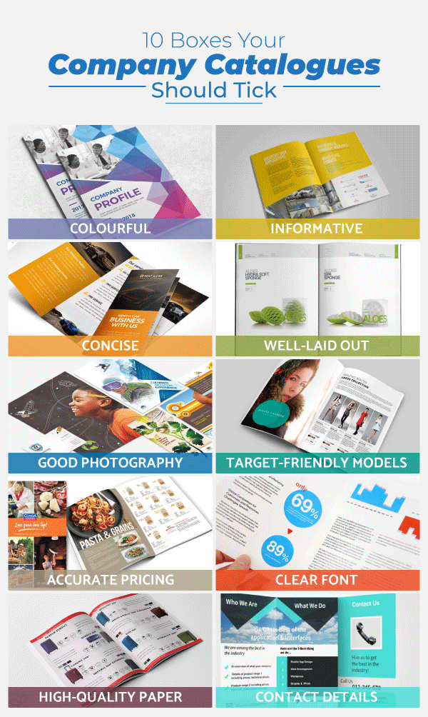
Colourful
Small children are drawn to bright colours, and even though we lose some of this excitement as adults, our eyes are still reflexively attracted to brilliant things. If you walk past a newspaper stand, you’re more likely to browse a glossy magazine than a black-and-white newspaper.
Select a design in full colour and get it done by a reputable publisher. Before you select the company that will produce your catalogue, ask to see other catalogues and brochures that they have produced. If you can see what they’ve done in the past, you’ll have a good idea of what your finished product might look like.
Informative
The whole point of a catalogue is to tell prospective customers all about your business. It gives them a visual representation of what you can offer them. Think about the questions they might have and try to answer all of them. Your product descriptions should include available sizes, colour options, and any accessories the product might need.
Sometimes, there is a series of products or services that have similar features. Since you know your products better than anyone, focus on what differentiates them from each other. Put that information in the catalogue, so it’s easier for readers to choose.

Concise
A catalogue is more visual than a price list. The latter might include the name of the product and its price with no further details. Catalogues are more visually driven. That means you should use as few words as possible to express the necessary information. It may help to offer your copy in bullet points, so it’s more compact and easier to absorb.
Well-laid out
The most important part of any catalogue is professional structuring. If you want to hire a sound catalogue designer, Sydney serves as a base for quite a few. They combine design skills and marketing know-how to make your catalogue easy to use. For example, they can call out slow-moving products so that consumers are more likely to focus on them.
Good design also makes your catalogue aesthetically pleasing, making users less likely to throw it away. They may even put in on display in a waiting room, which means more people see it. The wider your catalogue’s reach, the better your chances of making a sale.
Good photography
As we’ve mentioned before, catalogues are visually driven, so it pays to invest in a good photographer. For your products, don’t use stock footage. Get your pack shots professionally done, in high resolution, and with the right lighting. If you build up an archive of good photos, you can re-use them for years to come.
Target-friendly models
You might have noticed that people like context. That’s why an outfit on a mannequin sells better than something folded on a shelf. Use this element in your catalogues by placing your products or services in-situ. Show a relatable model enjoying your service. The models you choose should be representative of your target audience. For example, if you’re selling household products, pick a friendly mum-next-door rather than a celebrity socialite.
Accurate pricing
If you’ve been in business for a while, your product offering might not change. You probably have an upgrade of what you had before or a wider selection, but your range is consistent. However, prices shift constantly, and you should make sure the costs in your catalogue are up to date. If a customer calls because he or she is ready to buy and you quote a higher price than what they were prepared to pay, you don’t just lose the sale; you may also lose their trust. It may force you to offer a ‘discount’ which will lower your profit margin.
Clear font
Some brands select their font based on how pretty it is. They will pick a cursive font or one with elaborate serifs. A professional designer can help you choose one that is easy to read. They will also advise you on what style or colours to use in headers and prices. Customers shouldn’t have to struggle and strain to read your catalogue. Make it easy for them.
High-quality paper
Sometimes, marketing decisions are driven by budgetary demands. It’s much cheaper to print your catalogue on recycled paper and newsprint. However, your catalogue isn’t something you publish every week. It’s more likely to be a monthly project. For some products and services, the catalogue covers the entire year.
Because it’s a one-off expense, you can justify splurging on it. Plus, since it will be thirty days or even a year before you produce another catalogue, it would be nice if the catalogue lasted that long. If your catalogue is useful, customers will thumb through it, again and again, leaving it smudged and dog-eared. High-end paper will safely withstand a year of usage.
Contact details
The most important part of any catalogue is you. Yes, you’re marketing products and services, but none of that matters if your prospective clients don’t know where to find you. The inside covers should contain your contact details.
You can have them listed on the front and back, to make sure clients can remember. Positioning them at the beginning and end of the catalogue also makes them easy to look up. Include your office location with a map where possible. You should also list phone numbers, websites, social media accounts, email addresses, partner agencies, and distribution centres.
Read More:


